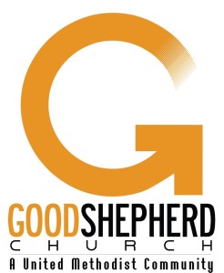
It went through focus groups, staff dissection, volunteer input, and then final, enthusiastic approval.
Our previous logo — a stylized shepherd holding a lamb — had become dated towards the end of its fourteen year run.
This one conveys Walking Together: the starting point is lightly shaded, suggesting we all start our journeys from different places. But the arrow signifies a unity of purpose. We’re walking towards who Jesus is and what Jesus is about.
Plus, the logo has a clean, modern look that’s easily transferrable onto T-shirts, bulletins, hats, banners, and tennis racket strings.
Just kidding on the last one.
If you’ve seen the glass doors of the church recently, you’ve seen the G that’s virtually impossible to miss.
It looks how we want it to look and says what we want it to say.
And . . . just wait until you see the Worship Center platform on Sunday.


There are 3 comments
I don’t know if enough research was conducted prior to adopting this logo. I hope it doesn’t suggest that we are chasing our tails or running in circles!
Interesting that the process ended up with including “A United Methodist Community”
I like how Good Shepherd embraces its Methodist connections more than some churches starts of similar age, and I recognize that Good Shepherd does not endorse all that goes on in Methodism. I am curious, though, how much discussion that part of the logo generated.
The idea of “A United Methodist Community” appeared and received quick consensus. It didn’t take much time at all.